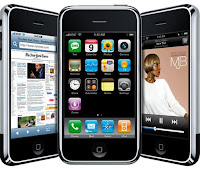
Finally, an iPhone - a review by a first-time user.
After a 14 year love affair with Nokia, only briefly interjected twice by Samsung and HTC, I have finally moved on to the domain of Steve Jobs. The great, grand Steve Jobs. My new Apple iPhone 3GS has taken me - for the time being - to a different plane altogether now.
 |
| A bite, anyone? |
Media played its role too. Apple turning into a tech company with the world's highest market capitalisation, and laudatory reviews appearing persistently in global media played their own part. The clincher perhaps was a full page article in last week's The Economist which talked at length about the travails of Nokia. Somehow, I thought, let me try this new stuff.
So here I am with my new iPhone 3GS - 16 GB. Do excuse me, as I write with some enthusiasm! I am using this stuff for the first time, and as someone who can appreciate the beauty of original thinking, I think I am in love with a lot of what it has to offer.
But first, the precautions:
- As a Nokia enthusiast, it will take some time to get adjusted to an iPhone. The first 48 hours are most painful. The thought of switching back to Nokia crossed my mind several times, but I persisted, and tried to learn all the features. And it worked!
- The interface is everything. Apple wants you to enjoy the iPhone. One cannot really use it - one has to begin to enjoy it. Then you start becoming a part of Steve Jobs' vision of technology serving man, and not the other way round.
- The iPhone is symptomatic of the new world of smartphones that will be the lingua franca of the mobile industry in years to come. Even at the entry level, chances are, iPhone like features will be industry standard. But iPhone is not built for India! It's too smooth, too shiny and too soft for it. That's a huge minus, and hence one needs to be physically very cautious while using it.
- Learning the on-screen typing will take some time. It is not easy. Nokia enthusiasts accustomed to the tough qwerty keypads may find it frustrating to actually focus their minds on individual alphabets as they pop up in big sizes (beautiful!) as you type from the onscreen keyboard. It takes some time before you realise the wonderful magnifying glass waiting to be at your beck and call!
Now, the adolescent moments of joy!
- The touch experience is breathtakingly beautiful. It just rolls! And rolls! And if you learn it fast enough, and move your fingers 'across', it rolls even faster. This is pure joy. Seamless, non-jerky, non-discrete. Silicon Valley has scored a big plus over Scandinavia, in touch.
- The way Apple has ensured simple tasks remain simple, in a touchscreen environment, is praiseworthy. To delete an sms/email, just wipe your finger across and the red coloured delete button appears for you! It sure gives you a sense of control.
- The icons are outstandingly beautiful. Steve Jobs' love for calligraphy, simplicity and beauty is all too visible in the way each icon is designed and placed.
- SMS experience is totally different. Instead of being stored as discrete pieces of communication (like in most other handsets), various SMSs exchanged between any two people are shown in a series of communication bubbles. That changes everything! You can view your entire conversation with someone over time, not just pieces of it (though there is a major minus in it, which I will mention later).
- Typing, copy-pasting, deleting is all very intelligently designed. A new user must spend some focussed time learning these tricks of the iPhone trade, to fully release its raw power and energy.
- Setting up the phone is a lovely experience. Smooth as silk, everything settles down quickly, and the unique packaging (in which it arrives) makes you scared at first (Oh my god!, this is so different.. I hope I can handle it) and delighted soon thereafter!
- Managing pictures and videos is really very cool. In fact, the entire phone - oops, device - is all about its "cool" factor. It is very visible that Steve Jobs and his team have done everything possible to retain the "cool" factors even while the device goes about handling the most mundane of tasks. Making calls, for example. The way the list of calls made (recd/missed) is displayed, and gels with creating new contacts is superb. It is extremely user-friendly once you master it. It takes some time for that, though.
- The device's homepage icon management is classic. You can do anything you want to - this is one freedom very few companies offer. You can create multiple home pages, with any possible arrangement of icons. That is the extreme to which you can push customisation. And it really helps generate a sense of ownership in the owner's mind (it did, for me!). The way a folder gets created is classic - just drop an icon "into" another icon, and presto! the folder is ready - it uses commonsense.
- The online iTunes store's width and depth surely must be huge, but I have not started using that fully so far. I guess it must be one of the most populated online stores, and options on applications must be varied and rich. My son's first horrified reaction "Dad, nothing is for free here!!!" proved wrong when we spotted the "Free" tab, and discovered a whole host of free goodies available. Now for an Indian user, that's really important :-)
- The arrival of 3G networks in India will multiply the pleasure of using an iPhone. It is truly designed for that infrastructure only. The tardy speeds at present kill the joy of seeing a webpage load in all its glory, with easy navigation and delete options.
- Using the phone in hands-free mode (without a headset) is very convenient as the on-screen icons are very large and clearly visible.
- Spending time on online-social-networking (OSN) on this handset is very interesting. From feeling that you are on a miniature PC to enjoying the adjustable-screen-display-tilt feature, it glides fairly smoothly. Webpages are a breeze.
- Emails are very smooth to manage. And the push-mail feature makes it very Blackberry like (though almost all brands offer this feature now). But I must admit - Blackberry is totally business-like in appearance and behaviour. So perhaps the iPhone is for evolved business-persons! Ha ha. And thank God they do not restrict the number of email accounts one can install.
 |
| iConic |
 |
| Steve Jobs and his digital world |
But the product is far from being "perfect". Limitations are:
- SMS communication thread makes it very difficult to identify the last received sms from any user (as it gets inside some communication somewhere!). It is only upon the first prompt that you can see the fresh sms clearly, and then it is lost inside the whole list of communication threads stored. You may change this through the settings feature, I guess, but the thread utility will be lost then.
- Why, oh why, do you have to create a separate tool for a thing as mundane as a SIM card slot! It is a foolish idea. The pin just cannot be preserved safely for long. And since billions of other handsets in the world are easily working with a manually (and easily) openable sim card slots, why do we need a pin in the iPhone to accomplish that task?
- It is clear that Steve Jobs did not have India in his mind while designing the iPhone. My small advice - please wake up to the subcontinent's realities, if you really want to crack the market here. The dust, grime, sweat, jerks, tumbles and drops here are unlike anyplace else. The iPhone is too sophisticated to become a mass product in India (which ultimately Apple will try to become). It catches dust easily, gets scratched very quickly, and the real danger of the windshield ruined to pieces is all too scary!! I have issued clear instructions to both my kids that the first one to smash my screen will have his/her PC confiscated.
- The handling of the device needs extra care. Apple should put a good grip on either sides of it, that's leathery and rough, so we can hold it properly. Smooth metal is hardly the best idea!
- Of course, it is costly!
- The best way to silence an incoming call is to have an on-screen icon like most other handsets have, by default. The lack of this feature in the iPhone 3GS surprises me - is there some higher purpose here? (you can silence it by tapping the volume-control switch provided on the left side)
- I am still not able to see the "automatic into drafts folder" option for sms that you suddenly lose while typing (Nokia has this very useful feature). It is very irritating to lose a large w-i-p sms after typing out most of it!
- It is frustrating for a business user to notice the lack of a flash while taking pictures. It ruins many images totally. Nokia rocks in this feature! Apple iPhone 4 removes this anomaly, but it's fairly costly for that.
- We all know that Apple is a closed universe - their own hardware, their own software, their own policies, and their own showrooms (mostly). So it will take some time before adjusting to this reality. This is in stark contrast to a very open Nokia system, that grows on you like addiction in no time. (the Ovi service never could catch on as much as Nokia would love it to)
- The microphone quality is a bit inferior though, and one needs to speak loudly at times, when using the speakerphone mode.
- The auto screen-tilt feature is not foolproof in the iPhone. It works best when the phone is held perpendicular to the ground, not when it is at an angle.
- A big irritant is the absence of a "delete all" feature for sms and emails. How do you delete multiple sms / emails? One by one? Come on!
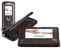
- Big letdown - Battery gets drained very fast, not a suprise given the size of the display screen. So while one could get away with a 2 days non-charging period with the Nokia E90, here it's a tight situation, even with a low 'screen brightness' setting.
- An advice to Apple and Steve Jobs - send a team of designers to India, and let them study the sturdy, tough, unbreakable (almost) handsets of other manufacturers that operate for the Indian market. In the long run, that learning will work wonders for Apple, as it goes about grabbing a meaningfully large share of the Indian market.
 |
| Nokia's great vision |
Let's see how this battle evolves in the months to come. It can move in any direction, as writing Nokia off may be foolhardy. They simply can bounce back with a disruptive product that again takes people like me to their fold (what a waste of money it will have been then!). For the time being, let me partake of life's little pleasures including wiggling icons, the silver-smooth Apple logo, and rapturous communication threads!
Thanks for reading, and have a good day!
A comprehensive, topic-wise and useful collection of my various posts and answers can be found here. Enjoy.
~
Promo:
For excellent educational services, check these out:
All Courses www.pteducation.com/Courses
For IIM-CAT Prep http://www.pteducation.com/mba.aspx
For UPSC Prep http://www.pteducation.com/upsc.aspx
For MBA exam analyses https://pteducation.com/MBAtestanalyses/
For UPSC exam analyses http://ias.pteducation.com/UPSCexamAnalyses.aspx

